
Article: Spring Summer 2026 Fashion Trends: The Key Colors
Spring Summer 2026 Fashion Trends: The Key Colors
If Pantone identifies Cloud Dancer as the starting point for the season, the Spring/Summer 2026 runways expand the chromatic discourse with a more articulated and dynamic palette.
Alongside luminous neutrals, pastel shades and full colors emerge, extending beyond clothing to include bags and accessories.
The result is a wardrobe that works with chromatic layering: essential in its basics, but capable of lighting up with more decisive and contemporary accents.
What are the fashion colors for Spring/Summer 2026?
With burgundy and brown, which defined 2025, now archived, the new palette asserts itself with a brighter and more conscious presence: color becomes language, attitude, declaration.
On the runway, the season moves between nuances that convey a softer and more intentional elegance. Butter yellow illuminates looks with an almost impalpable delicacy, a shade many designers have chosen as a new alternative to neutral, capable of warming without ever being intrusive.
Alongside it, mocha mousse evolves the idea of brown: creamier, more sophisticated, it breaks away from winter depths to take on an enveloping and contemporary dimension, as seen in collections focusing on a new idea of quiet luxury.
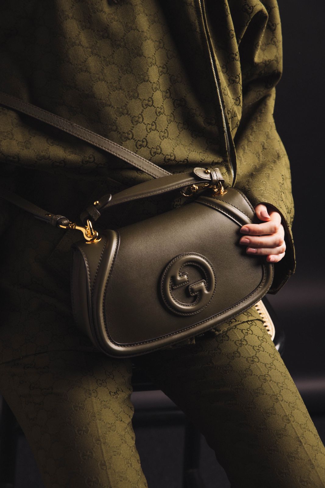
Olive green remains a constant presence, but it lightens: less utilitarian, more refined. It is the color of natural minimalism, evoking materials and landscapes, reinterpreted with clean lines and light fabrics.
More ethereal is powder blue, which moves through the season with an almost suspended lightness. It is a shade that speaks of balance and precision, often used to build dynamic but never rigid looks.
And finally, powder pink: a discreet but persistent presence, moving away from any idea of predictable romanticism to become a sign of a more subtle, yet still evident, femininity.
And, alongside solid colors, floral patterns re-emerge, reinterpreted in a more graphic and less narrative key to introduce rhythm and movement, in a continuous dialogue between chromatic purity and decoration.
All-over neutrals: not just Cloud Dancer
After seasons dominated by dense and enveloping tones, neutrals return to the scene with a new intention.
This time, not as an exercise in subtraction, but as a precise aesthetic choice: to make space, lighten, and bring the wardrobe back to a more essential dimension.
Among these, Cloud Dancer stands out as a key reference. More than a white, it is a soft and diffused presence, almost suspended, running through long dresses, light shirts, and relaxed-cut tailored suits.
On the runway, it is interpreted as a form of "visual pause": a conscious gesture that replaces excess with purity, without ever appearing cold or rigid.
Around this shade, a range of warm neutrals develops, from beige to ecru to flesh tones, building a fluid and sophisticated base. These colors do not impose but gently accompany: surfaces on which fashion works to redefine proportions, textures, and various layers, allowing materials and garments to speak for themselves.
The result is a renewed minimalism, less rigid and more sensorial, where simplicity becomes an evolved, never complicated, and deeply expressive language.
Bright colors and pastel shades: the contrast made into a palette
Spring/Summer 2026 builds its identity on contrast.
On one hand, the delicacy of pastel shades, on the other, an explosion of full, saturated, declared colors. It's not a matter of opposition, but of rhythm. The spring palette moves between lightness and intensity, without ever truly choosing.
Butter yellow evolves: its softness is now accompanied by a more vibrant version that doesn't just fade but asserts itself, transforming into a true visual statement.
Green, for its part, follows an even clearer trajectory, leaving behind olive and earthy nuances to increase saturation levels, thus becoming one of those shades that lead the entire look.
Orange enters the scene with the exact same energy, appearing in a luminous and (often) deliberately excessive version, bringing new dynamism to the wardrobe.
And then blue, in all its meanings: from light blue to cerulean and electric, its various nuances overlap, creating total blue looks with a strong visual impact.
It is in this continuous dialogue between pastel and saturation that the palette takes shape. No longer a choice between discretion and visibility, but the possibility of experiencing both.
How to combine Spring/Summer 2026 trend colors: color-block
In 2026, color doesn't just exist: it dialogues and amplifies.
The keyword is just one: color-block. It's not a novelty, but a freer and more instinctive reinterpretation of a language that fashion knows very well.
Combining distant tones becomes an intentional gesture, with the sole aim of creating visual tension with combinations that work precisely because they are completely unexpected. The result is a vibrant, moving palette that captures the eye and holds it.
On the runway, this direction takes shape in precise pairings, from ochre and purple at Valentino to pink and red at Balenciaga.
In short, color-block represents a well-calibrated style choice: building the look through color, not around it.
It's a new way of thinking about combinations: less predictable, more instinctive, and, above all, more alive.
Spring/Summer 2026 fashion colors in summary
The season's runways have defined a clear palette, characterized by natural tones, pastel colors, and more intense accents. Among the Spring/Summer 2026 fashion colors, these stand out:
-
Butter yellow, a luminous and sophisticated butter yellow shade
-
Mocha mousse, an elegant and versatile warm brown
-
Olive green, perfect for minimal and natural looks
-
Powder blue, delicate and easy to combine
-
Powder pink, romantic and refined
-
Pop red, soft but impactful
These shades reflect a trend towards balanced and easily combinable palettes in the everyday wardrobe.


